
I’m always stoked to be invited back to Victoria University to guest lecture. I was humbled to share some of my own experiences and learnings to a class of graduate students studying Interaction Design. It was also fun to present remotely to the class while we were all still in lockdown. I was asked to talk about the principles that we at PaperKite use to create digital experiences. Here are some of the tips I shared:
It’s tempting to think that you understand your users inside and out. But this is a terrible assumption! An assumption that even PaperKite fell for years ago.
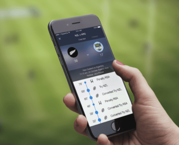
Back in 2014 our team was full of sports fanatics so we were all super excited to be building the All Blacks app. We released a feature that would allow users to look back through the history of rugby cup competitions to find stats from years ago. It was a killer feature for any sports nut. So, a user wants to view the history of cups gone by in the app – what icon did we use? A cup trophy icon. Genius right?
Wrong! The app was live and nobody (and I mean nobody) was finding this super-powerful feature. What went wrong? We assumed our users would get it the way we did. But we aren’t our end users. We can get way too close to the products we are building. Since then PaperKite has built out a kick-ass UX research practice. We talk to users well before we’ve even started thinking about writing code. Talking to users – a super simple but core part of the process – has fundamentally changed the way we build products at PaperKite.
Apps like BPMe are designed to trigger and respond to real world actions. This app allows you to authorise buying and paying for fuel or pre-ordering a coffee. So a common mistake would be to only focus on what happens on the app screen and not consider all the other external factors that go into visiting a BP service station.
Think about how your digital solution fits into the real world
But a digital experience is totally wasted if the human or physical experience falls over. If the technology on the petrol station forecourt is slow, or the barista doesn’t make your order quite right, it’s going to impact your perception of the App experience as a whole. So our top tip here is; don’t just limit your thinking to what happens on the device – consider the entire customer journey the whole way through.
As mentioned earlier, user feedback is incredibly important! But don’t just have a kneejerk reaction to feedback. Find trends in feedback rather than focusing on one person’s opinion. Just like in life, you won’t ever keep everyone happy and that’s okay.
Bad app store reviews will always exist. Even in our ampm app where customers literally complained about winning free stuff! It’s natural to try and react to every single piece of feedback but that’s not a good way to build products. Use research methods to find themes and trends. And make sure that anything you change supports your strategic goals, rather than just responding to users who might want something that sits outside of the original problem your product is solving.
As mentioned in Tip 1, you probably know your product more intimately than anyone else. So don’t assume that your users will automatically understand your design. And if they are finding things hard to understand, it’s probably not their fault.
If the users of our products are accidentally activating features, making purchases or doing things that they didn’t intend, it’s probably because the interface is confusing or simply not taking into account the context the user is in. Learn from observing how your app is being used to improve your product, but don’t blame the users.
This last tip is very close to my heart. What is it that makes two similar experiences stand out from one another? They can have the exact same feature set on paper, but it’s likely that it’s one small detail that you remember. A cute illustration. A graceful transition. A playful animation.
We brought the Hell and Beervana apps to life through the use of small animations throughout the interfaces. This could be a beer filling up to show a loading state, or having animated flames on the home screen. Something that makes a user smile have a long lasting impact. These small details are often the best way to bring a brand to life and stand out from the rest.
(The loading animation we used in the Beervana app)
These principles and a bunch more have been helping PaperKite build world class digital experiences for years. We offer tips like these in a App Audit service where we assess the mobile offerings of businesses and provide strategic recommendations. You can read more about PaperKite’s Mobile App Audits here.
It’s always so much fun speaking to Victoria University Graduates and sharing PaperKite’s success and what we’ve learned along the way!
If you want to discuss any of the above then feel free to get in touch via twitter or email!
New digital project? Keen to optimise your existing digital project? We’re always keen to talk.
Made with ♡ in Wellington
© 2020 PaperKite