Apple’s first foldable iPhone goes on pre-order on 17 October NZ time (16 October in the US), and is available from 23 October. Most of what matters for your app can be tested now, in the simulators that come with the Xcode 27.1 release candidate.
What the phone does to your app
iPhone Duo has two screens. Folded, there's a 5.4-inch screen that behaves much like any other iPhone. Unfolded, there's a 7.6-inch screen closer to a small iPad, which you can hold upright or sideways.

How your app looks on the inner screen depends on the SDK it was built with. Apps built with the iOS 26 SDK or earlier sit in the middle with empty space around them. Built with iOS 27, they fill most of the screen but keep clear of the status bar on the right edge. Built with iOS 27.1, they extend edge to edge on both screens, and toolbars and tab bars move to vertical positions below the status bar. Apple says content has to adapt to those vertical bars before a build made with the 27.1 SDK ships. The automatic change applies to the system navigation bars. Custom bars don’t take part automatically, and Apple’s guidance covers keeping bars horizontal in some cases, such as sheets. So the question for each screen is which bars the app uses.
From April 2027, apps uploaded to the App Store must be built with the iOS 27 SDK or later. Duo screenshots become mandatory on the same date.
What we found
We’ve just been through this with an iPhone app we look after for a client. It’s iPhone-only and portrait-only, and we hadn’t made any foldable changes. We built it with the iOS 27.1 SDK.
On the inner screen, the app filled the display and turned sideways with the device, even though it was only ever designed for portrait. One of our developers captured every main screen in three states: folded, unfolded upright and unfolded sideways.
Most screens were fine. The problems were at the edges. On the folded screen, the camera, clock and Wi-Fi indicator sit in a column in the top-right corner, and on a few screens that column covered part of the app. One tab label sat under the status bar. The close button on a sheet was hidden behind the camera. These are safe-area fixes, the same kind of work the notch and Dynamic Island needed.

The bigger question is around design. Unfolded and held sideways, Apple moves toolbars down the side. Several screens have a back button or menu along the top that could move across to match. That needs a designer’s input. Another app we look after faces the same choice, so we’d rather decide once for both.
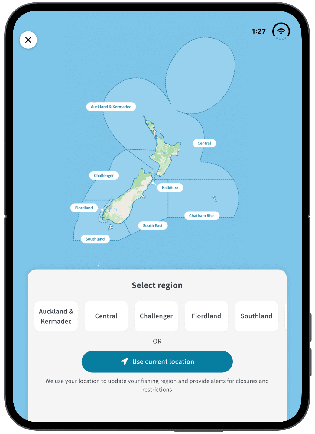
A simulator can show you most of this today. It can’t tell you how easy a button is to reach on a 7.6-inch screen, or how that status-bar column looks on real hardware. We’ll check these things once we have a device.
How to test it yourself
Apple’s preparation guide is a three-step checklist: run the resizability check, fix the listed patterns, then test with three tools. It doesn’t say which screen states to check or what counts as a pass. The steps below follow Apple’s checklist. The three-state review is our own addition.
Run the resizability check. In Xcode, ask the coding assistant “get my app ready for iPhone Duo”. It scans for the patterns in the next section and suggests a fix for each. For other coding agents, run xcrun agent skills export in Terminal. It doesn’t catch everything, so review the list yourself.
Test the resizing in three places. Use the iOS resizable simulator in Device Hub. Use iPhone Mirroring on macOS 27 and resize the window to extreme sizes in both directions. Use the iPhone Duo simulator in Xcode 27.1, which Apple says gives the best view of the full native experience.
Check every main screen in three states. Folded, unfolded upright and unfolded sideways. Note anything under the camera or status bar, and any screen where a sideways toolbar would make sense.
A layout problem you probably already had
Apple says an iPhone app can now have any combination of size classes. An iPhone can be regular width, so the app shouldn’t assume a wide screen means an iPad, and it shouldn’t pick a layout by device type. If your app works out its layout from the space it’s been given, iPhone Duo is mostly one more window size.
Apple’s checklist flags these patterns. The examples are UIKit and SwiftUI.
UIScreen.main.bounds. Use the view’s or window’s bounds instead, or GeometryReader in SwiftUI.
Orientation checks such as UIDevice.current.orientation. Compare the available width and height instead.
Idiom checks, such as userInterfaceIdiom == .phone or == .pad. Base layouts on size classes or available space instead.
Treating regular width as iPad. horizontalSizeClass == .regular no longer means iPad, because an iPhone can be regular width.
Hard-coded device sizes, such as bounds.height == 844.
Full-bleed images using .scaleAspectFill or .aspectRatio(contentMode: .fill). On a wider display these can crop content that matters.
Much of this is familiar adaptive-layout work, and it pays off on every window size. Resizable iPhone Mirroring on the Mac will expose it too. Vertical controls and the fold add device-specific questions on top, so this list doesn’t finish the job.
What to do before 23 October
Run the three-state check on your main screens as a first review. It’s a starting point. It doesn’t cover partial folds or Split View, so test those before you call the app done. Fix anything sitting under the camera or status bar. List the screens where a sideways toolbar would make sense, and make that call with your designer rather than rushing it. Then ship the update in a build made with the iOS 27.1 SDK, which is the build that has to adapt to the vertical bars. Apple hasn’t announced a deadline for 27.1. If that won’t be ready in time, an iOS 27 SDK build stays acceptable after April 2027, when iOS 27 becomes the minimum SDK for uploads.
If you’d like a second pair of eyes on how your app behaves on iPhone Duo, or help deciding which changes are worth making now, talk to us.
Let's create something powerful, together