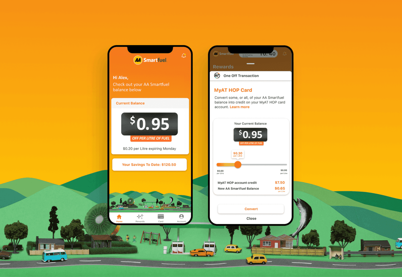
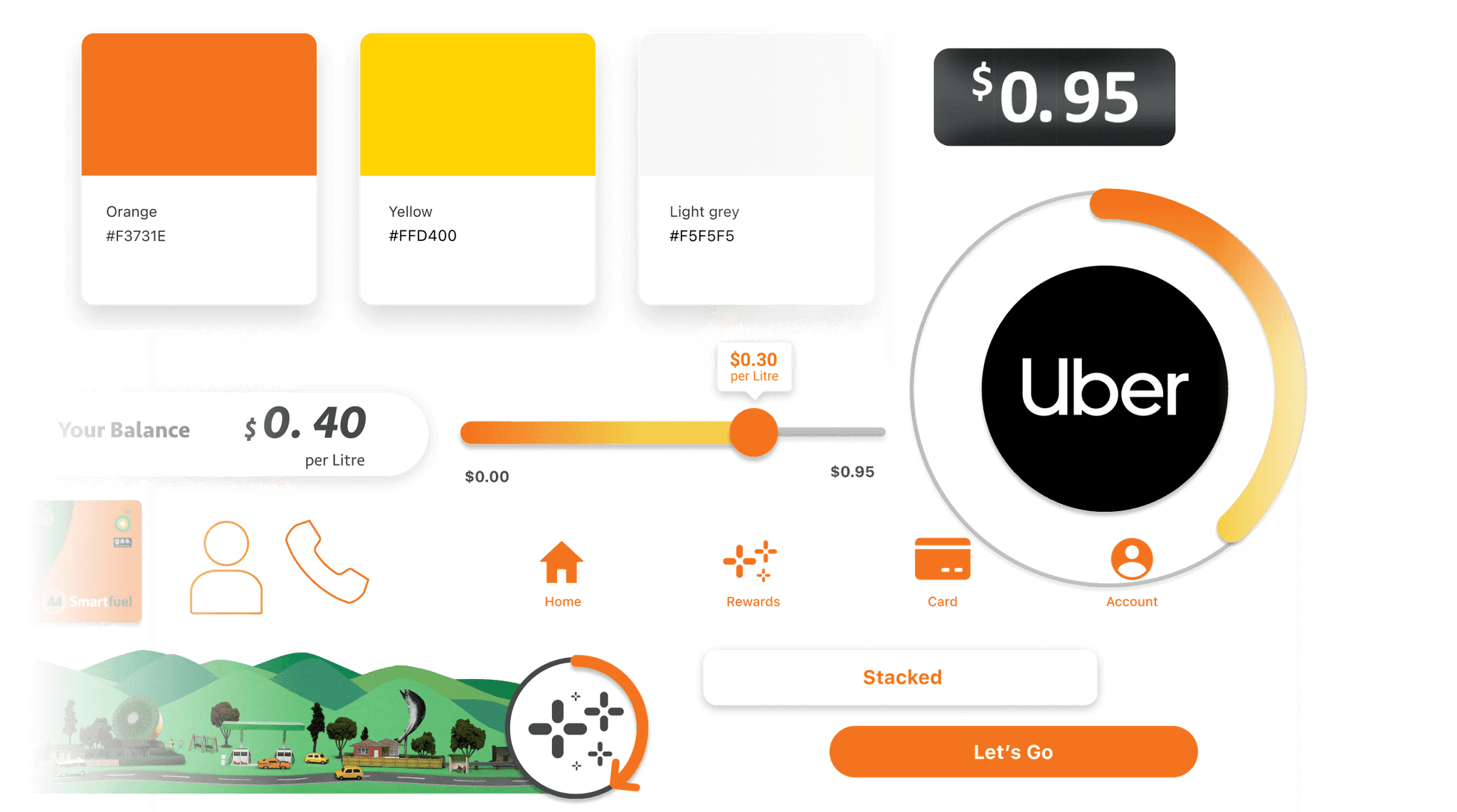
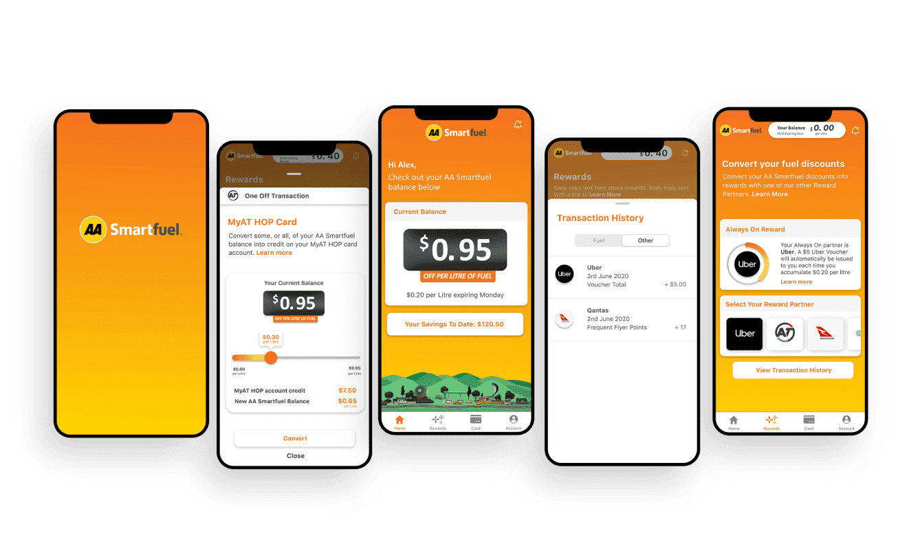
What we delivered
UX Discovery
UX Design
Delivering more than just fuel offers
As consumers, when we think of petrol stations, we typically think of filling up our vehicles, picking up a snack, and whether or not we have a fuel discount offer to use. AA Smartfuel was keen to understand their customer base, what they valued and what they found difficult to use within their current app. By understanding their current customer needs and usage, the AA Smartfuel team was able to future proof the app for innovative offers and enhancements to their loyalty programme.
Loyalty programmes have notoriously high levels of inactive members. A key rationale to redesign the app was to make the app more attractive to inactive members, as well as support future loyalty programme developments for active members.
Industry trends toward low and zero carbon mobility options were also a consideration for the AA Smartfuel team – how could they maintain relevance in a rapidly changing environment? How could AA Smartfuel evolve their offering to be part of every customer journey, no matter how the customer chooses to travel? Non-fuel redemption offers will certainly be part of the future of the programme too.
Rather than leaping straight into a build-test phase for the app, based purely on AA Smartfuel’s strategic objectives, the team were intent on undertaking a UX Discovery and UX Design phase to ensure that the app design allowed for future loyalty developments. The design would need to allow for the redemption of points for more than just fuel (credit or vouchers for other redemption partners, and other types of discounts). The app design also needed to be flexible enough to enable rapid scalability to bring new partners on board to the programmes – both at the front and back end of the product.
The UX Discovery Process
Our first step was to undertake user research with current AA Smartfuel customers. The research insights and in person customer observations (using a mobile app prototype) were incredibly valuable to the AA Smartfuel team, who don’t often get the opportunity to hear from their customers first hand, and see the app in action. We were able to marry this output with app analytics to build a true picture of how customers were interacting with the app and which features they valued or struggled using. This UX Discovery phase was invaluable to truly understand the customer experience of interacting with the app and provide insights as to how they would want to use it in the future.
The UX/UI Design Process
Once user research was completed, the UX/UI design concepts were able to be created. The PaperKite Design Team was issued the challenge to come up with a handful of concepts to present back to AA Smartfuel, based on the data and insights from the user research. A new look Interaction and Visual Design was created for existing app features, but also created for future redemption partners and offers. Longevity of the UX/UI was important, to ensure we catered for known future enhancements to the programme – essentially a fit-for-growth architecture.
Updated UX concepts were validated with users to ensure we retained what worked well for existing customer journeys, while making sure future features were allowed for.
To ensure client budget management, we utilised the existing mobile app codebase and API, reusing the codebase we could in the redesign process.
Working together, remotely
Much of the project took place during the 2020 lockdown, with PaperKite and AA Smartfuel teams alike working remotely from home offices and bedrooms. Despite difficult conditions, the AA Smartfuel team remained committed to the project – regularly attending stand ups, answering queries quickly to remove blocks and ensuring the project was able to keep moving. Efficient, collaborative working relationships emerged amongst the AA Smartfuel/PaperKite project team, with Slack playing a key part in inter-team connectedness.
Our engagement with this particular project was limited to the UX Discovery and UX Design phases only, rather than the build and test phase which was rolled out by AA Smartfuel’s existing technology partner.
Unexpected insights and lightbulb moments
We often find that the very nature of a discovery or UX project, unearths unexpected insights and curve balls (often positive ones!). This project was no different. The research phase identified the need to simplify the language of the loyalty programme (redeem vs rewards, one-off vs always on etc) and better explain the calculations behind the offers. Transparency of the programme was clearly important to users.
Within the app itself, we made some simple changes to improve the user experience: screen grabs of the latest offers to add visual interest and depth to the app, horizontal scrolling of all participating partners to allow for a significant volume of new partners joining the rewards programme in the future.
Our recommendations ensured we delivered a great user experience, and importantly a mobile first solution with native components to reduce development costs.
Today’s AA Smartfuel app helps you to track your points balance, savings to date, recent transactions, soon to expire discounts, and more. The mobile-first user experience we’ve developed, will support the next generation loyalty programme that is on its way. We’re watching with interest!
— Jordan Tran, Marketing Manager, AA Smartfuel


